Making Beautiful Plots: Data Display Basics
March 30, 2012 | By Angela Landrigan
You’ve labored at the bench and generated data that you’re about to meticulously analyze before preparing the results of your hypothesis-testing for presentation. In this post, we’ll discuss elements that factor into making beautiful (and consistent) displays of data. View our recent post on Analysis Consistency in Flow Cytometry for a discussion of broader themes relating to analysis consistency.
To summarize what will follow in short: make sure all of your data are on scale, accurately compensated, and make sure all your plots are well-labeled.
Choosing plot types, appropriate statistics, and telling the full story
There are a number of plot types that can help you tell your story in different, visually pleasing ways when used appropriately. Among the flashier ways to display data are heatmaps, histograms, and histogram overlays. These one-dimensional representations owe their appeal largely to their ability to convey an easy-to-understand message: “This population changed in X amount in Y condition.” Where this gets tricky is if you’re trying to describe a heterogeneous population. When deciding on a plot type to use to convey your story, you’ll want to make sure you’re telling the whole story, and not omitting important information about the behavior of subsets in the course of eliminating a dimension of data display. In Cytobank, you can mouse over a heatmap square to display the underlying dot plot, which will reveal another dimension of information of your data.

Excerpted from Irish JM et al (2010) PNAS, 107(29):12747-54, Figure 1B.
(Click on the image for higher resolution)
Choosing the appropriate statistical measures to assess your plot contents is the next step in building Illustrations of data. There may be some cases where you want to examine changes in raw MFI for a population, or other cases where rare populations emerge where you’ll want to use percent in gate or 95th pecentile as your statistical measure. These statistical measures will populate a table of statistics below your plots on Cytobank, and will inform the color-coding of color scales for heatmaps and histogram overlays.
Labeling
After you’ve selected plot types and statistical measures, you’ll want to make sure your plots are well labeled in a consistent manner. Adequate labeling is essential to the interpretation of your data. Check that axes are labeled and tickmarks are present for all plots. Make sure that color scales are present for heatmaps and other color-coded representations. Cytobank Illustrations were designed to automatically build plot layouts that contain the necessary labeling components, and elements such as color scale values and the display of tickmark numbers can be customized through the “Plots: Scale Display” box on the left side of the Working Illustration page.
Compensation
In this multiplexing era where multicolor fluorescence-based flow cytometry abounds, the application of a compensation matrix profoundly transforms a dataset. Verifying that data are not over- or under-compensated is another step in the process of making beautiful plots. Consider an example where you’ve stained whole blood with FITC-anti-CD3, PE-anti-CD4, and PE-Cy5-anti-CD8, and have also collected single stain controls. There is overlap among these emission spectra, and so compensation must be applied to discount overlapping signal. You’ll want to determine that the data are appropriately compensated, and not over- or under-compensated.

(Click on the image for higher resolution)
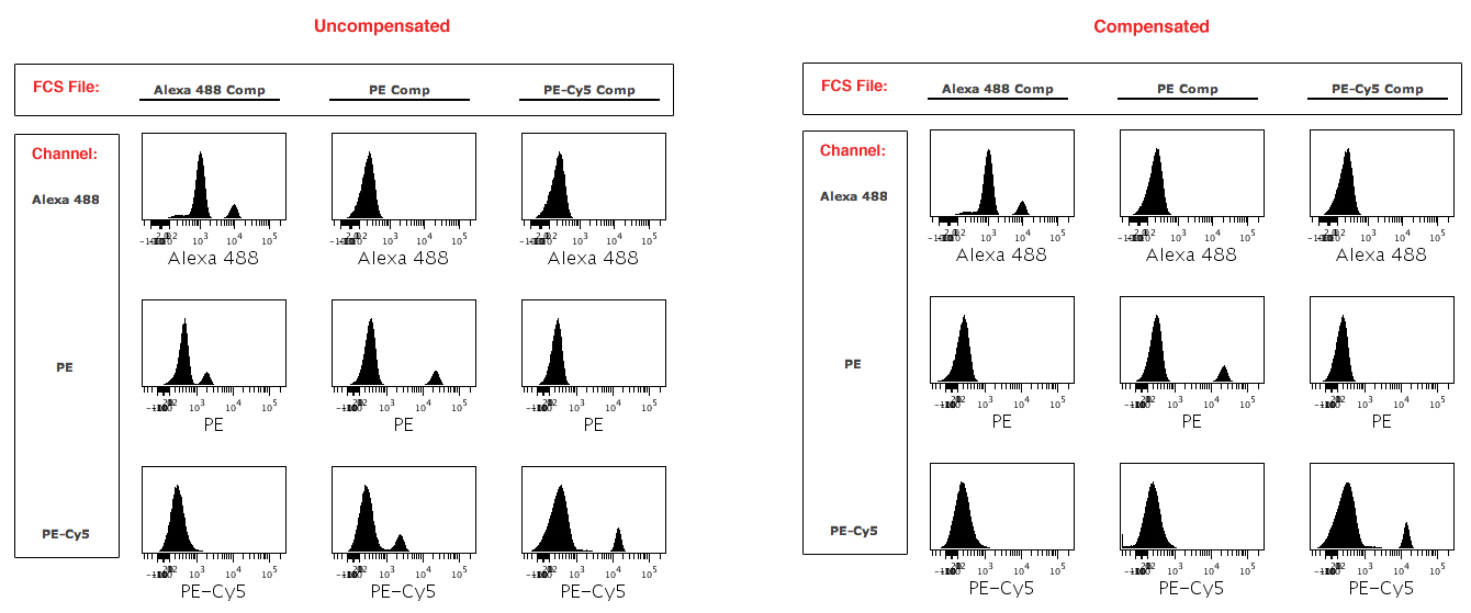
One way to check for over- or under-compensation is to build an Illustration that lays out plots of your single stain compensation controls, showing data on each channel for each single stain control (Figure 2). You can do this using your single stain compensation controls, which you ran alongside your experiment. With proper compensation applied, you’ll see two peaks in the positive channel and only one peak in all of the other channels. In our example above, the FITC channel will have two peaks for the FITC positive control, and the PE and PE-Cy5 channels will each have one peak when the data are properly compensated. If the data were undercompensated, you would see two peaks in the PE channel. Likewise, if the data were overcompensated, you would also see two peaks in the PE channel. Setting up a layout of your single stain controls viewed across all channels will assist you in optimizing your compensation matrix values. Another way to examine the effects of your compensation is to view all channels plotted against each other in a pairwise plots view for your sample data, which can be found in the Advanced Views section of the Working Illustration on Cytobank.
Scale Settings
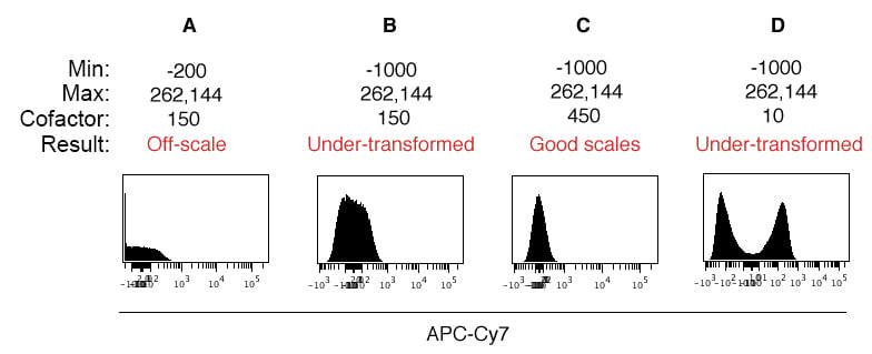
Perhaps one of the more important factors to consider when displaying flow cytometry data has to do with scale settings. Zooming in on an example using uniform beads to demonstrate the effects of proper scale settings, Figure 3 shows how to adjust the scale minimum and cofactor using a negative control. In this example, the default Cytobank scale settings were automatically applied to the experiment upon upload (Figure 3A), and the scale settings and cofactor were adjusted for proper data display (Figure 3C). We’ll walk through some background and how to correct the scale display values.

On a conceptual level, you know that you want all data to be visible in your plots (i.e., no truncation), and that the single cell distributions accurately reflect the presence or absence of populations. A good first step in this direction is to make sure you collect fluorescence data with biexponential scaling enabled in the data acquisition software (for digital machines), as this will allow you to collect data with values below zero. Generally, the collection software will automatically adjust the scale minimum such that all events are captured, and you can always manually adjust these settings.
Moving over to the analysis side, many analysis platforms have a set of standard scale settings that are applied to the visualization of your data, and these scale settings often need to be adjusted to ensure all your data are visible and distributions are properly calibrated. A great way to do this is to build an Illustration that shows channel data for negative controls for each channel (ideally with the compensation matrix you intend to use already applied). This is the same single stain control layout from the “Compensation” section above (Figure 2), and you can built it using single stain compensation bead controls that you probably already ran alongside your samples. You can set experiment scale settings based on these negative controls prior to proceeding with experiment analysis. The above figure shows such a scenario, where the compensation controls were used to adjust scale settings.
Returning to our example in Figure 3, the default scale settings applied to these data included a scale minimum of -200 and a cofactor of 150 (Figure 3A). We can see a spike in the leftmost bin and notice that generally the peak looks flat, indicating that many events are still off scale. So the first step is to lower the scale minimum to ensure all events are on screen (Panel 3B, scale minimum = -1000). Next, we see that signal peak still does not conform to a normal distribution, despite using uniform beads with no signal on this channel.
This is where the cofactor comes into play. The cofactor governs the size of the linear region around zero. The larger the cofactor, the smaller the linear region. By default, the cofactor is set to 150 in Cytobank. In this example, increasing the cofactor to 450 condenses the linear region, resulting in a normally distributed peak (Panel 3C) that mirrors the shape of peaks in other channels. If we lower the cofactor instead of increasing it, the linear region expands and a “data hole” forms near zero, resulting in an artificial display of two populations where we know only one population exists (Figure 3D). By adjusting the scale settings and cofactors for each channel using a uniform negative control, you can ensure that all your data are displayed, that they are revealing populations where appropriate (and not revealing false populations), and have an overall uniform look and feel. The cofactor, scale maximum, and scale minimum need to be set for each channel.
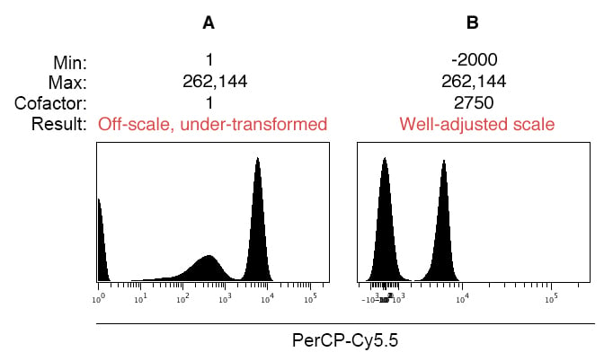
Here’s another example of the effects of scale settings on data display, following the same logic we just discussed. In this example, a 1:1 mixture of stained:unstained compensation beads:

(Click for higher resolution image)
Be aware that some cytometers default to using a Log10 scale (for example, the FACSCalibur and LSR II), and you have to specifically enable biexponential scaling to collect events below zero. Below we show the pitfall of displaying data near zero on a Log10 scale without biexponential scaling:

(Click for higher resolution image)
In Figure 5A, notice that there is a data spike on the low end of the scale near the Y axis, resulting in truncation of data and the creation of an artificial third population. In this scenario, the scale such must be adjusted such that it displays negative events, and using the arcsinh scale allows for configuration of the linear region around zero through adjustment of the cofactor.

